The Science Behind Colours: How Psychology Shapes Design
The Science Behind Colours: How Psychology Shapes Design
In the world of design, colour plays a vital role in capturing attention and evoking emotions. Have you ever wondered why certain colours are more appealing than others? It turns out there's a fascinating science behind colour psychology, which directly influences our perception and behaviour. In this article, we will explore the intricate relationship between colour and human psychology, and how it shapes design.
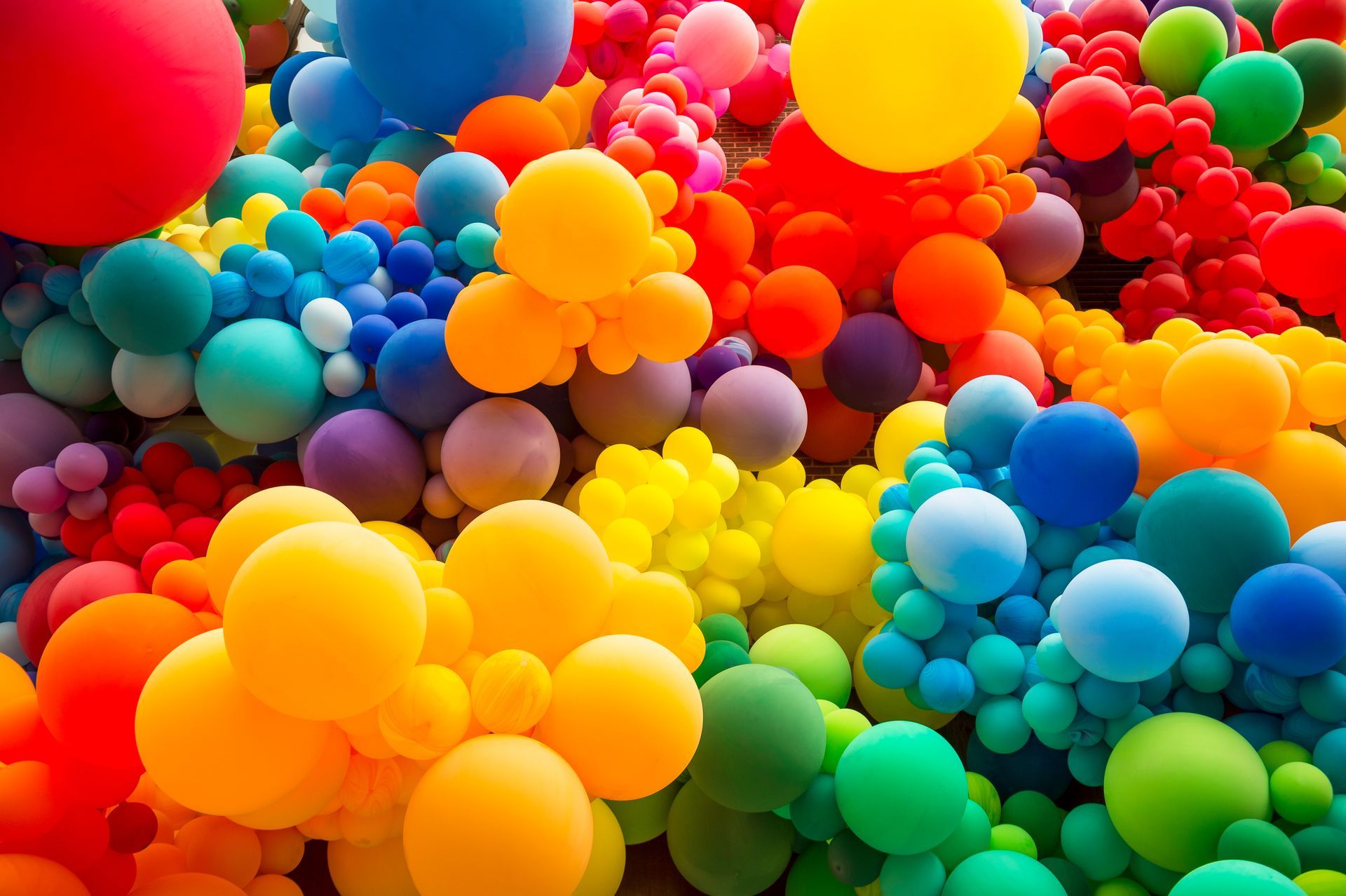
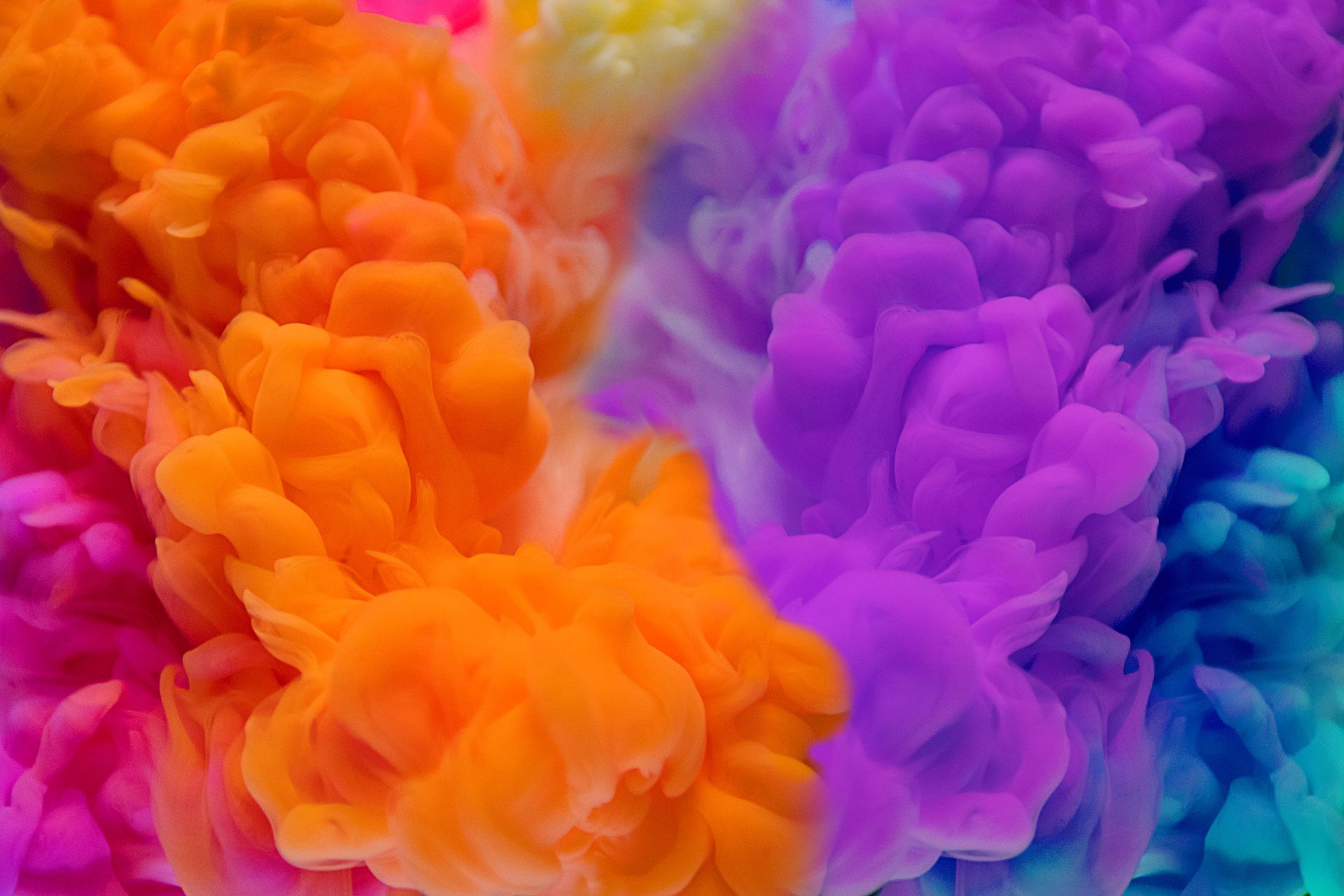
Colours have the power to evoke specific emotions and trigger certain actions. For example, warm colours like red and orange are often associated with energy and excitement, while cool colours like blue and green are known for their calming and soothing effects. Understanding the psychological impact of colours can help designers effectively communicate messages and create desired responses from their audience.
By incorporating the right colours into their designs, businesses can influence consumer behaviour, improve brand recognition, and even increase sales. From logos and websites to product packaging and advertisements, every design element can benefit from a strategic understanding of colour choice.
Join us as we delve into the science behind colours and uncover the secrets of how psychology shapes design. Get ready to discover the powerful impact that colours have on our thoughts and actions.
The impact of colours on emotions and behaviour
Colours have the power to evoke specific emotions and trigger certain actions. For example, warm colours like red and orange are often associated with energy and excitement, while cool colours like blue and green are known for their calming and soothing effects. These associations are not arbitrary; they are deeply rooted in our evolutionary biology and cultural experiences.
Red, for instance, is commonly associated with danger or passion. This is because our ancestors learned to associate the colour red with blood, fire, and other potentially dangerous situations. As a result, our brains have developed a physiological response to the colour, increasing our heart rate and adrenaline levels. This explains why red is often used to grab attention and create a sense of urgency in marketing materials.
On the other hand, blue is often associated with serenity and trust. This may be due to our evolutionary history of associating the colour with clear skies and calm waters, which are generally safe and peaceful environments. Companies like Facebook and Twitter have strategically chosen blue as their brand colour to convey a sense of reliability and trustworthiness.
Understanding the psychological impact of colours can help designers effectively communicate messages and create desired responses from their audience. By leveraging the emotional power of colours, designers can create experiences that resonate with their users on a deeper level.
Colour theory and its application in design
Colour theory is a set of principles and guidelines that help designers understand how colours work together and how they can be used to create visually appealing compositions. It provides a framework for choosing colour combinations that are harmonious and balanced.
One of the fundamental concepts in colour theory is the colour wheel. The colour wheel is a visual representation of the relationships between different colours. It consists of primary colours (red, blue, and yellow), secondary colours (orange, green, and purple), and tertiary colours (created by mixing primary and secondary colours).
Complementary colours, which are opposite each other on the colour wheel (e.g., red and green), create a strong contrast and can be used to draw attention to specific elements in a design. Analogous colours, which are adjacent to each other on the colour wheel (e.g., blue and green), create a harmonious and soothing effect. Understanding these relationships can help designers create visually pleasing and balanced colour schemes.
In addition to the colour wheel, colour theory also encompasses concepts such as hue, saturation, and value. Hue refers to the specific colour, saturation refers to the intensity or purity of the colour, and value refers to the lightness or darkness of the colour. These properties can be manipulated to create different moods and effects in a design.
By applying the principles of colour theory, designers can create visually appealing and effective designs that evoke the desired emotional responses from their audience.
Conclusion: Harnessing the power of colour psychology in your designs
Colours have a profound impact on our thoughts, emotions, and actions. The science behind colour psychology provides valuable insights into how colours influence our perception and behavior. By understanding the psychological impact of colours, designers can create visually appealing and effective designs that resonate with their audience and elicit the desired responses.
From evoking specific emotions and shaping brand identity to guiding user behavior and creating memorable experiences, the use of colours in design is a powerful tool. By leveraging the principles of colour theory, considering the cultural significance of colours, and understanding the effects of different colour combinations, designers can harness the power of colour psychology to create impactful and successful designs.
So, the next time you embark on a design project, remember to consider the science behind colours and how they can shape the overall experience. By incorporating the right colours into your designs, you can create visual masterpieces that captivate and engage your audience. Embrace the science of colour psychology, and let it guide you in creating designs that leave a lasting impression.